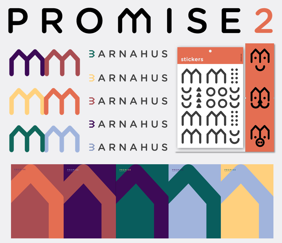
The refreshed identity embodies the essential characteristics of the Barnahus model: friendly and strong, dynamic and inclusive.
The M in PROMISE becomes a symbol for the project and the movement. It becomes a B to symbolise the Barnahus. The symbol transforms into a friendly character with kind eyes and smile. A sticker activity challenges your creativity to find other shapes and faces!
We are so charmed by this logo that we have started seeing the shape everywhere.
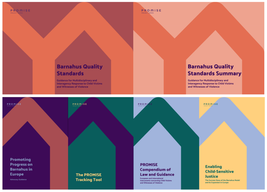
The evolution has already hit the website, Twitter, and the newsletter. The publications have also been relaunched with new covers.

