As part of the Network becoming an independent non-profit, we’re proud to announce a brand refresh.
When developing the new look, our guiding words were approachable, friendly but not childish, professional and competent.
The logo should convey warmth, openness and generosity. It should balance playfulness with professionalism. It should avoid using common symbols used in the child protection field such as hands, hearts, and blobby drawings of people. It should also avoid looking like a real estate agency.
Features of the new logo include:
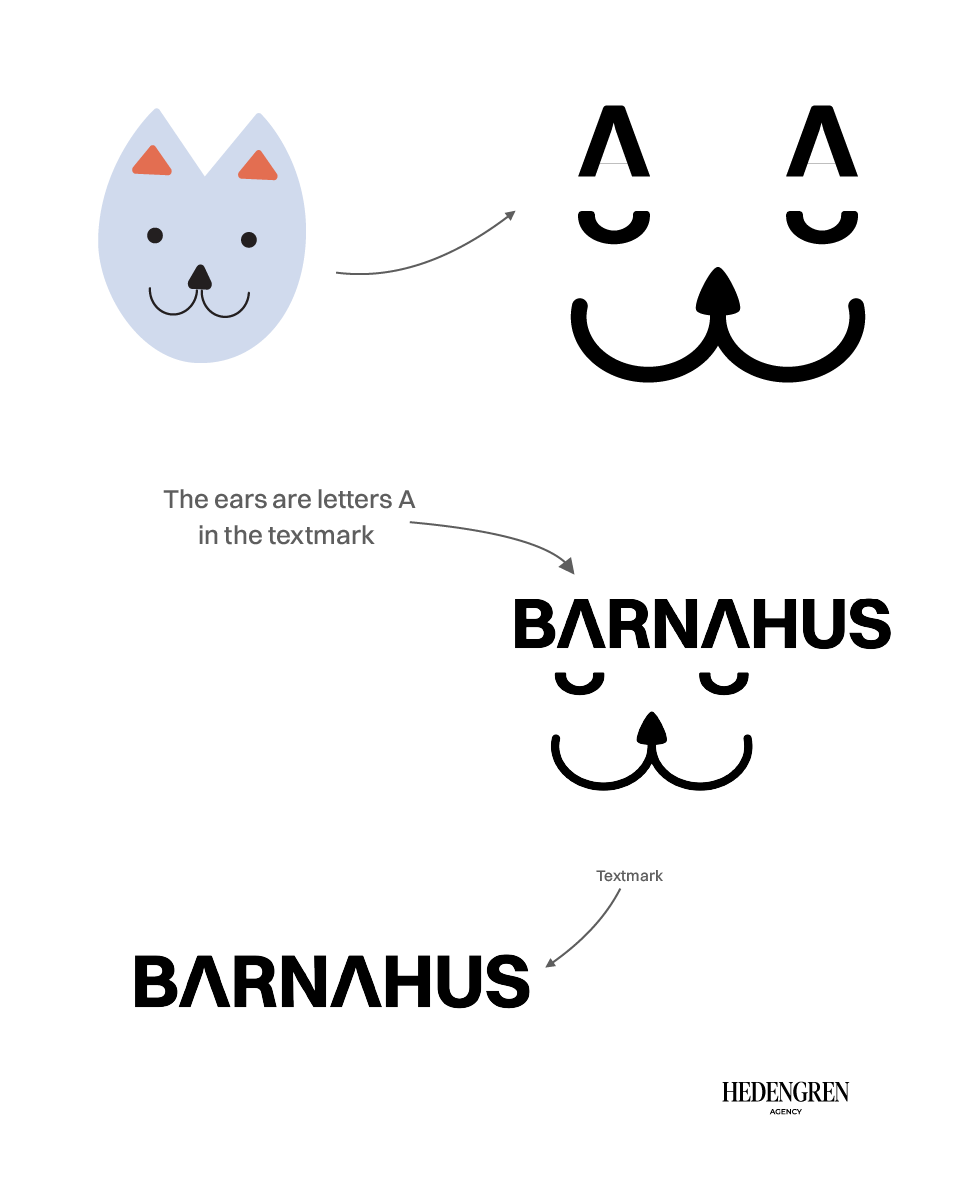
- Inspired by the plush fox mascot used in our illustrations explaining Barnahus.
- Can be as playful as the situation permits.
- Is a stylised interpretation, which doesn’t replace the mascot in other illustrations.
- Stand-alone versions can be used when space is limited or to adapt to the appropriate tone.
A new website is also launched as part of the brand refresh. The pages and texts have been reorganised to streamline finding key information.
The new logo, branding, and website were developed by Hedengren Agency.